Book Review: "Take Three Colours: Watercolour Seascapes" by Geoff Kersey
Hazel ScottHaving first learned to paint with only 5 fabric paint colors - yellow, red, blue, black and white - it came with a lot of struggle for me to keep my brush off black and white watercolors. Fortunately, I came across this Craftsy class by Kateri Ewing, which demystified many of the qualities of watercolors that I found perplexing. Kateri teaches the split-primary system, which is an amazing limited palette; but she has a video on YouTube that shows what an artist can do with even just TWO colors! I have such a fascination with limited palettes, and when I saw this title on the Kindle store, I was curious!
The reviews are good and the price is not crazy, so even though I hadn't heard of Geoff Kersey before, I got the Kindle version knowing I could return the title if I didn't like it. The book is a part of the "Take Three Colours" series by Search Press, where another title is also written by Kersey, "Take Three Colours: Watercolour Landscapes".
Kersey's palette here comprises simply of the primary colors, his selection being Cadmium Yellow Pale, Ultramarine and Light Red. He does not specify a brand name, but a photo on the Introduction section shows 3 tubes of Winsor and Newton Cotman, thus revealing the brand he uses and hinting emphasis on the audience for this book, which is written for beginners. He expands these 3 colors into 15 mixes which he labeled with descriptive names and a letter, for convenience in referring to them on the project instructions.
The sub-title of the book already tells you that you only need 3 colors and 3 brushes, so there are no lengthy discussions on materials. A paper type is suggested in the Introduction and the rest of the initial part are all about how to use the 3 colors and 3 brushes; after which Kersey goes straight into the projects.
There are nine projects, beautiful seaside scenes from the UK and USA, with illustrated step-by-step instructions, a photo of the palette and what mixes are used, some tips and a 'Jargon Buster' section that defines some watercolor and painting terminology to help beginners.
Here are a couple of the exercises I tried. I did most of these in the garden, on my son's kiddie table, while I kept an eye on him as he played. Despite not following the brush changes, I managed to get results I was happy enough with, using this little travel palette and two brushes.

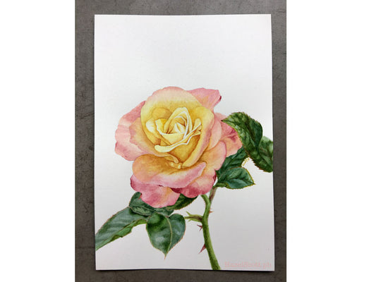
This is the first exercise I tried. I used my newest palette and just 3 colors, my own selection of Holbein colors: Cobalt Blue Hue, Scarlet Lake and Gamboge Nova. I used just one brush, #5 ProArte Connoisseur round brush on this 4"x6" watercolor journal.

This second exercise, Sand Dunes, was more of a challenge. I failed terribly but I persevered, after admitting that I've stumbled on a limitation of my palette, so I went and did this exercise as recommended. See below..

This time, I painted on a 7"x10" Saunders Waterford cold press block, with two different-sized round brushes. The top one uses the same Holbein 3-color palette. I still wasn't happy so I did it again using Greenleaf and Blueberry colors for the bottom painting. The sky is more stormy, mostly because the paints like to exert their own strong textures, but I'm way happier with the actual sand dunes. I'll probably do this a few more times!

And finally, this seashore with some application of perspective. I'm up to this exercise as of this writing, but I'll definitely do more from this book. I used Greenleaf and Blueberry paints, but used just one brush, the #5 ProArte Connoisseur round brush and went back to the 4"x6" journal.
Kersey gives good instructions and the illustrations demonstrate the steps well, you couldn't really do without one or the other. I would say you need some level of drawing confidence for some exercises, not high but just saying it's definitely not zero. In the last section, he does show how to transfer drawings, so if you are intimidated by having to draw, you could perhaps use the instructions to initially trace, if you are more interested in learning the painting process.
The book is 62 pages and retails on the Kindle Store for USD 9.85 as of this writing; a paperback format is available for USD 11.06 as of this writing. I got the Kindle version, which I read on an iPad Mini. Personally, I had no issues viewing it on this device since I could zoom in and the image quality is pretty good. You could actually go further in than you would if you were peering at the physical book. I tried viewing it on my phone, which has a relatively bigger screen for a phone, but I found it cannot be effectively read on a smaller screen because of the layout of the text and accompanying images, i.e. you need to be looking at the photos to understand the text, but doing this makes you zoom out to a point where the text isn't readable. There is a Kindle app for desktop, but panning the pages when zoomed all the way in is a bit of a pain since I have to use actions on a trackpad, I think it's only good if you have a massive computer screen, but if you have 13" or smaller, it won't be a good experience, IMHO.
All that said, I'd keep a copy of this book but I might consider returning the Kindle version and buying a paperback copy instead, for the unrelated reason of the iPad not being really mine, haha. In case you were wondering how I buy Amazon books from the Philippines, I use a cargo forwarder to ship US purchases to the Philippines. I wouldn't call it dirt cheap, but the rates seem fair and it's certainly more cost-effective than shipping straight from Amazon, you just need to plan your purchases to maximize the base cost. That's another post for another time.
I hope this review helps. As you can see, I'm a landscape/seascape super-beginner, so I'd love to hear your seascape painting tips in the comments :)